Speaking the same language
Telstra
The focus of this piece was to reimagine t.com (Telstra Website) in AEM leveraging the new Design Language, data-driven insight and innovative technology to unleash the power of teams to deliver holistic end-to-end journeys that empower all Telstra customers. This involved a shift and uplift in AEM including the design and build of a highly flexible, modular system of components and modules paired with experience optimisation. This has yet to be delivered to market.
The focus of this piece was to reimagine t.com (Telstra Website) in AEM leveraging the new Design Language, data-driven insight and innovative technology to unleash the power of teams to deliver holistic end-to-end journeys that empower all Telstra customers. This involved a shift and uplift in AEM including the design and build of a highly flexible, modular system of components and modules paired with experience optimisation. This has yet to be delivered to market.
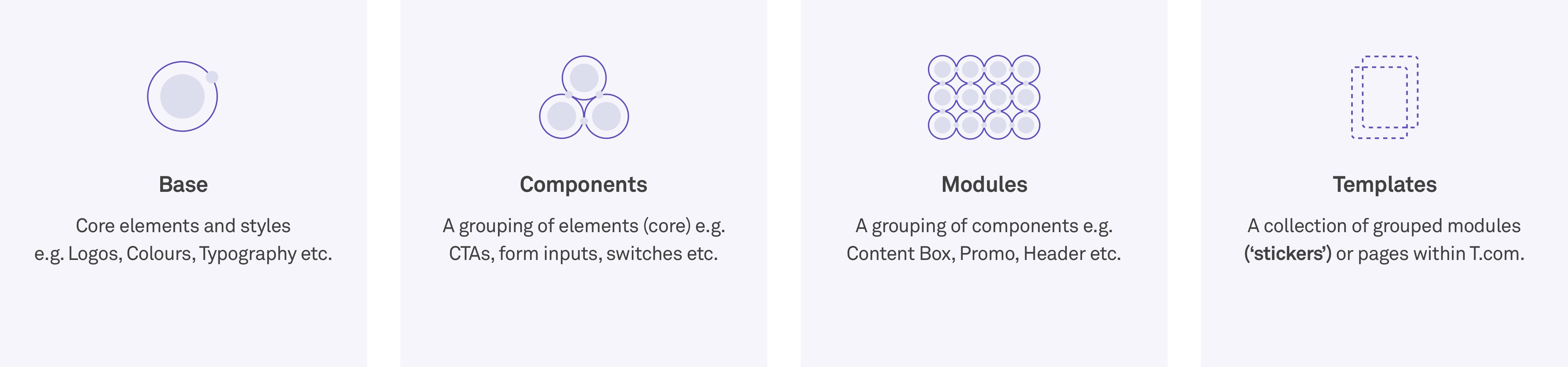
The purpose of t.com redesign is to design and reveal how a systematic approach can unite teams and provide consistency in the face of growing product demands. The goal: to radicalise Telstra’s workflow so that teams can spend less time on coordination and more time on crafting the experiences they love. In order to successfully scale, t.com was designed according to atomic design theory - that is designing elements, modules, templates, and pages concurrently to work together to create an effective interface design system.
The purpose of t.com redesign is to design and reveal how a systematic approach can unite teams and provide consistency in the face of growing product demands. The goal: to radicalise Telstra’s workflow so that teams can spend less time on coordination and more time on crafting the experiences they love. In order to successfully scale, t.com was designed according to atomic design theory - that is designing elements, modules, templates, and pages concurrently to work together to create an effective interface design system.
Primary goals
- Design and build a solid foundation of robust highly flexible and adaptable assets within AEM.
- Shape the future for a unique and meaningful digital customer experience for all t.com users.
- Work with a dedicated Telstra Design System team to design and build it’s flagship product.
- Meet inclusive design commitments of AA accessibility.
Enhance customer experience and deliver higher quality at greater speed. - Refine iteratively based on data insights and drive operational effectiveness to go market faster.
Primary goals
1. Design and build a solid foundation of robust highly flexible and adaptable assets within AEM.
2. Shape the future for a unique and meaningful digital customer experience for all t.com users.
3. Work with a dedicated Telstra Design System team to design and build it’s flagship product.
4. Meet inclusive design commitments of AA accessibility.
5. Enhance customer experience and deliver higher quality at greater speed.
6. Refine iteratively based on data insights and drive operational effectiveness to go market faster.
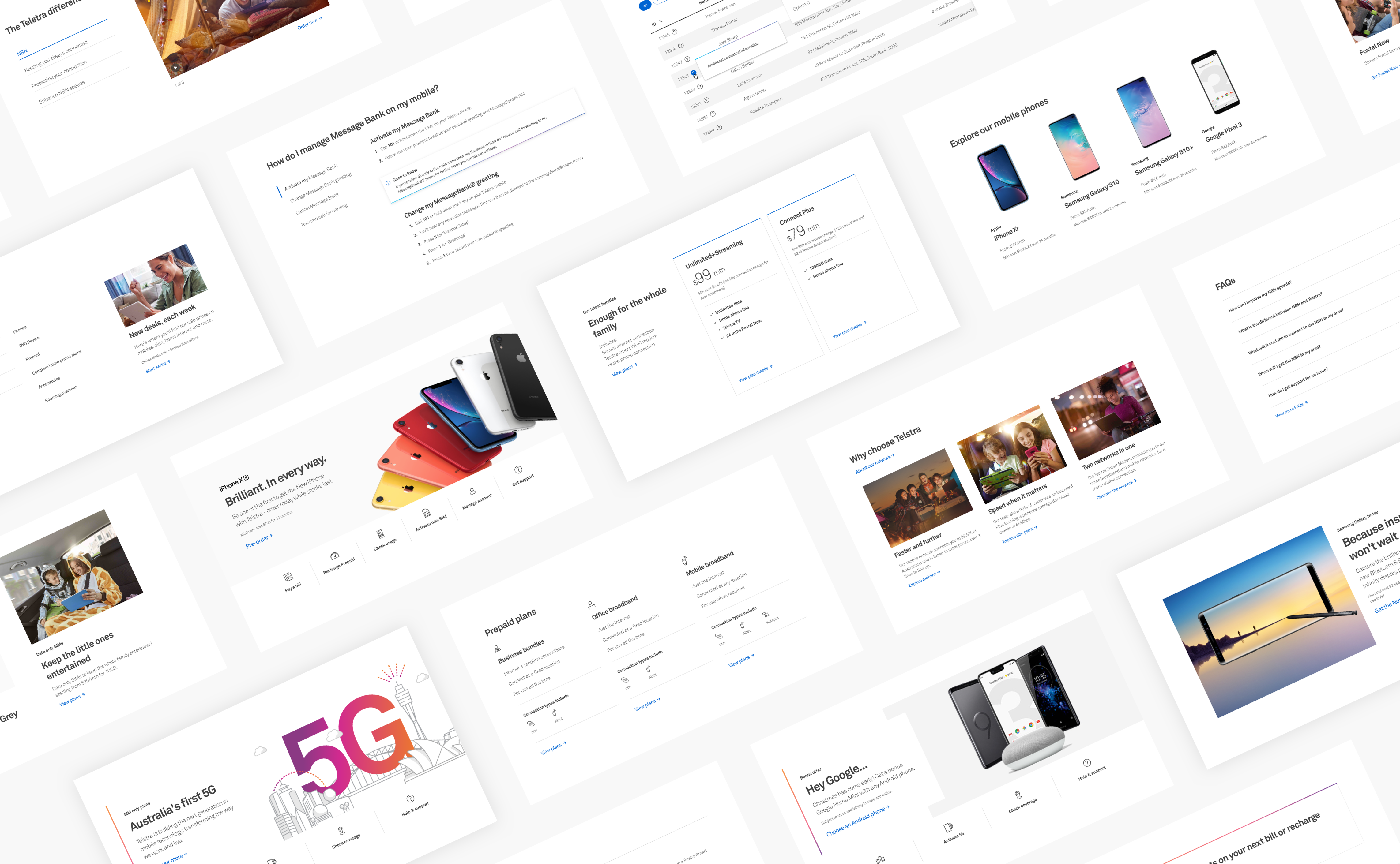
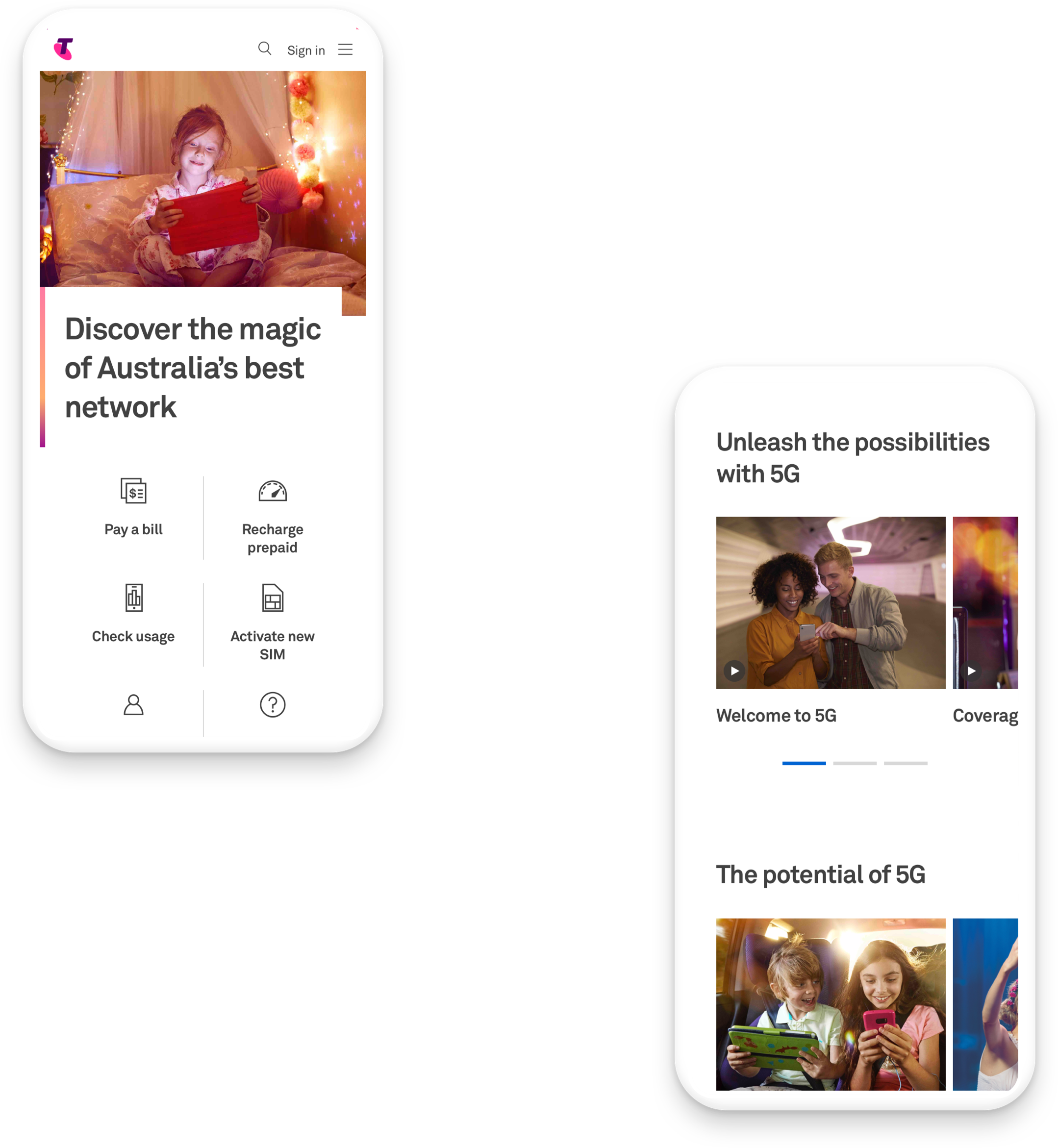
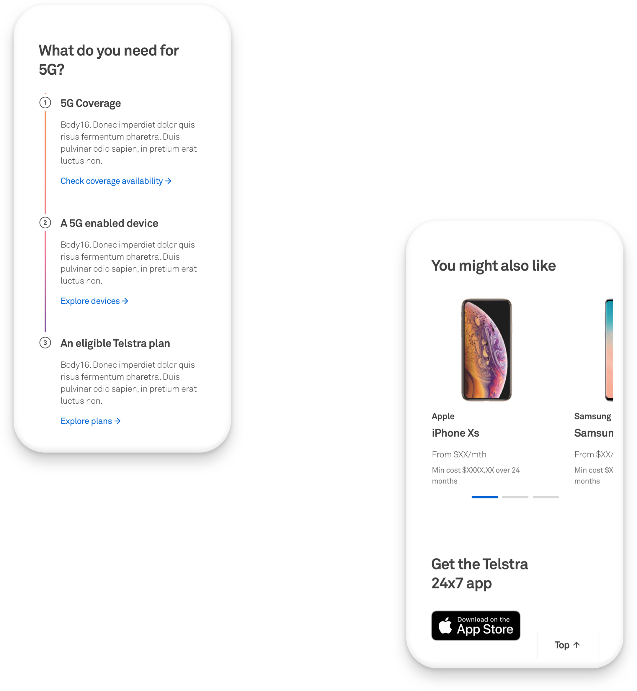
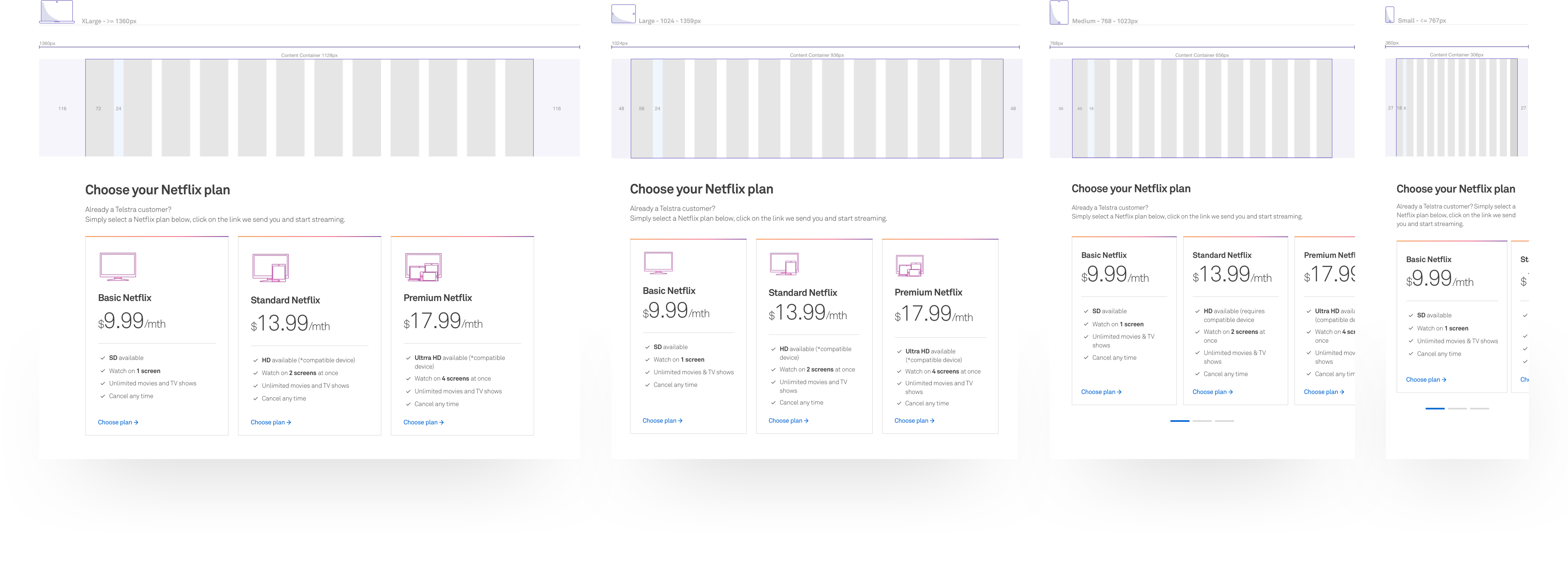
The starting point was to begin strategically applying the new Visual Language in a way that helps users cognitively identify and classify UI elements. This involved the design and build of an ecosystem of highly flexible and adaptable modules that drive functional/visual consistency and can be delivered faster to market.
The starting point was to begin strategically applying the new Visual Language in a way that helps users cognitively identify and classify UI elements. This involved the design and build of an ecosystem of highly flexible and adaptable modules that drive functional/visual consistency and can be delivered faster to market.
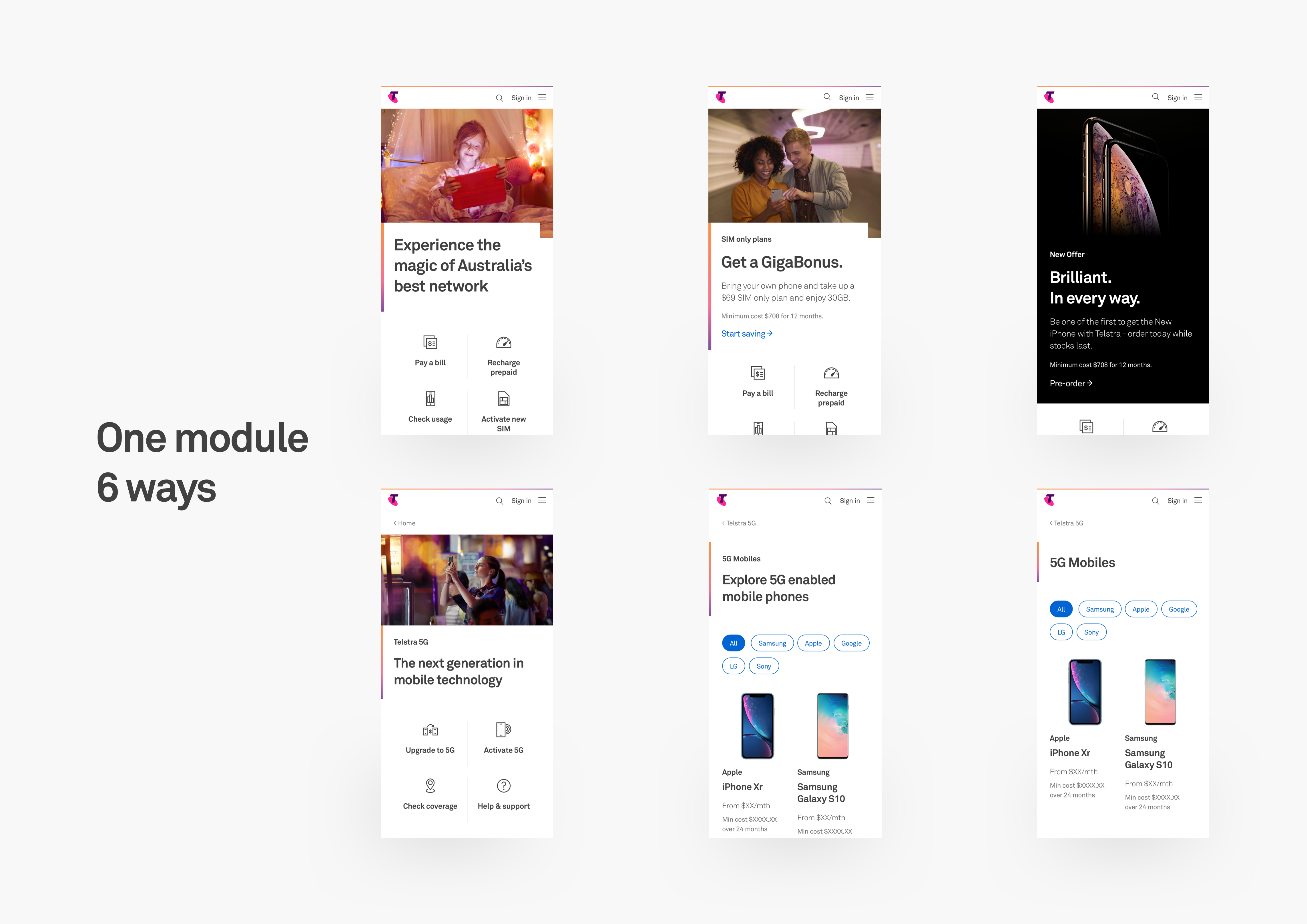
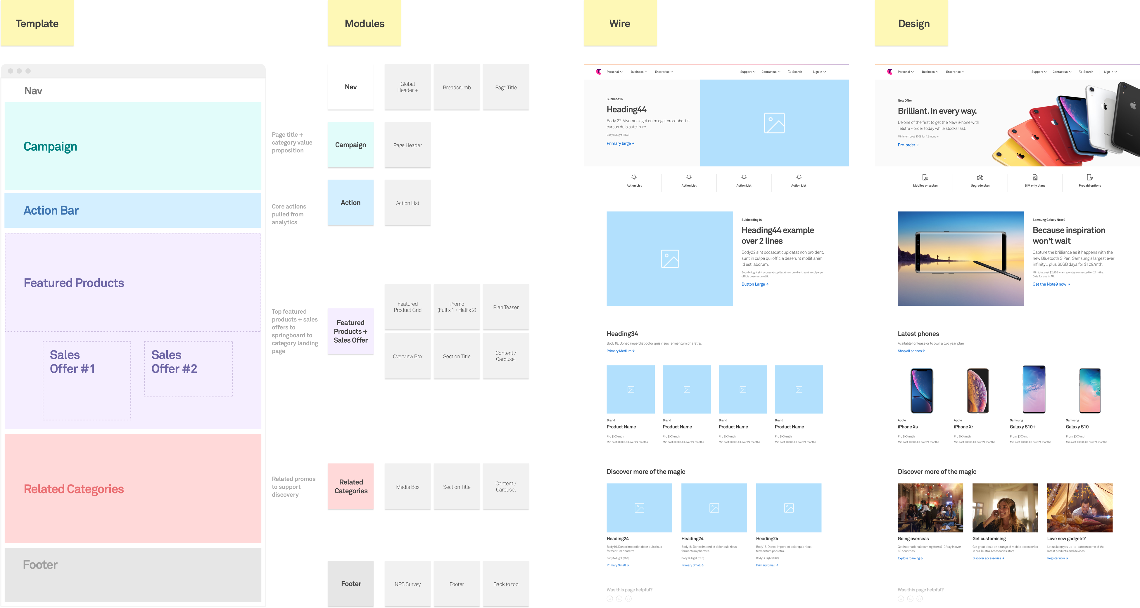
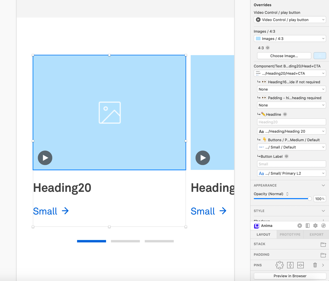
Component/Module design provided better collaboration between design and development allowing the design language to evolve over time. The deliverable being a collection of reusable modules (guided by clear patterns and standards) that could be quickly assembled together to create a world-class product.
Component/Module design provided better collaboration between design and development allowing the design language to evolve over time. The deliverable being a collection of reusable modules (guided by clear patterns and standards) that could be quickly assembled together to create a world-class product.
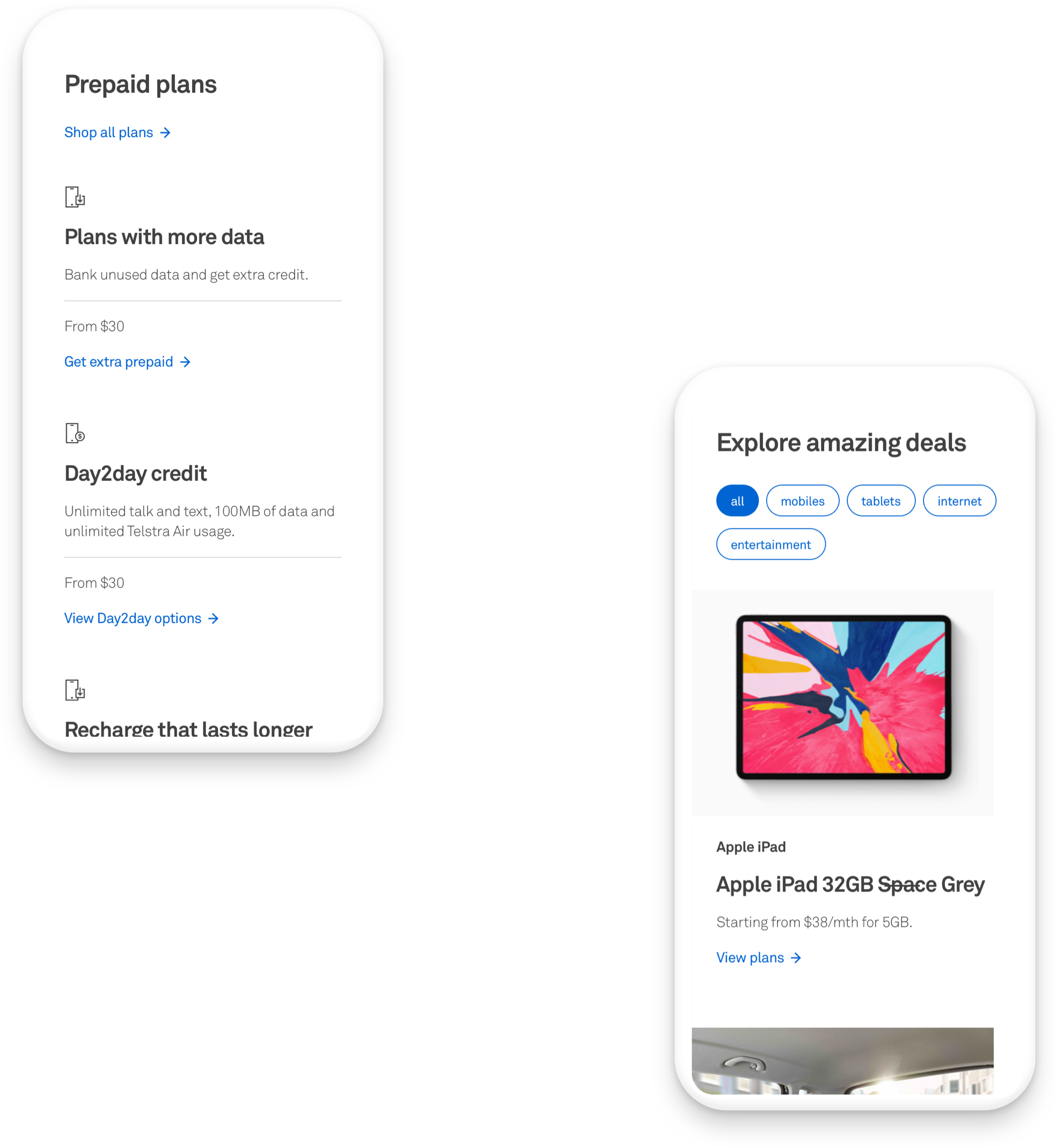
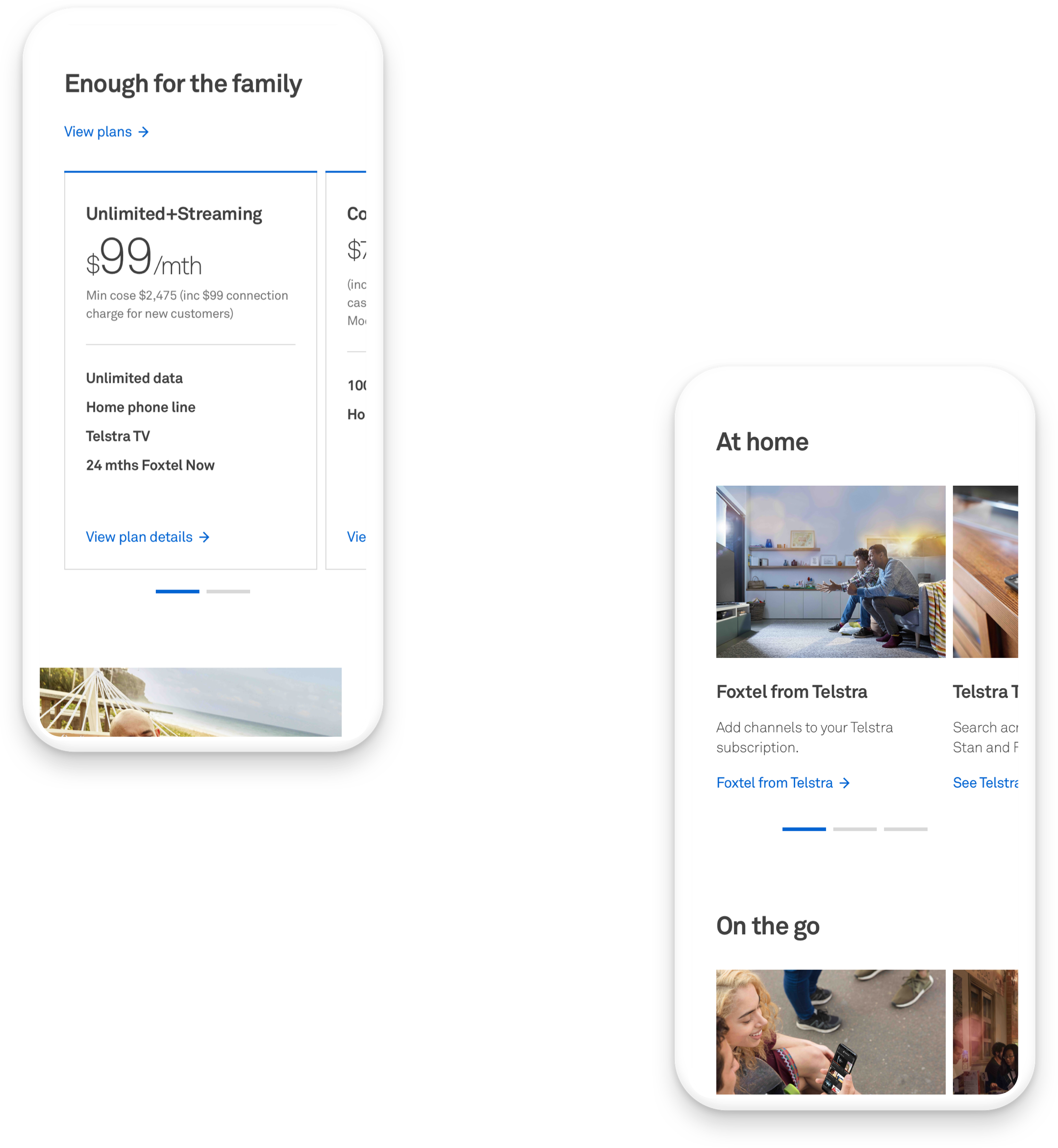
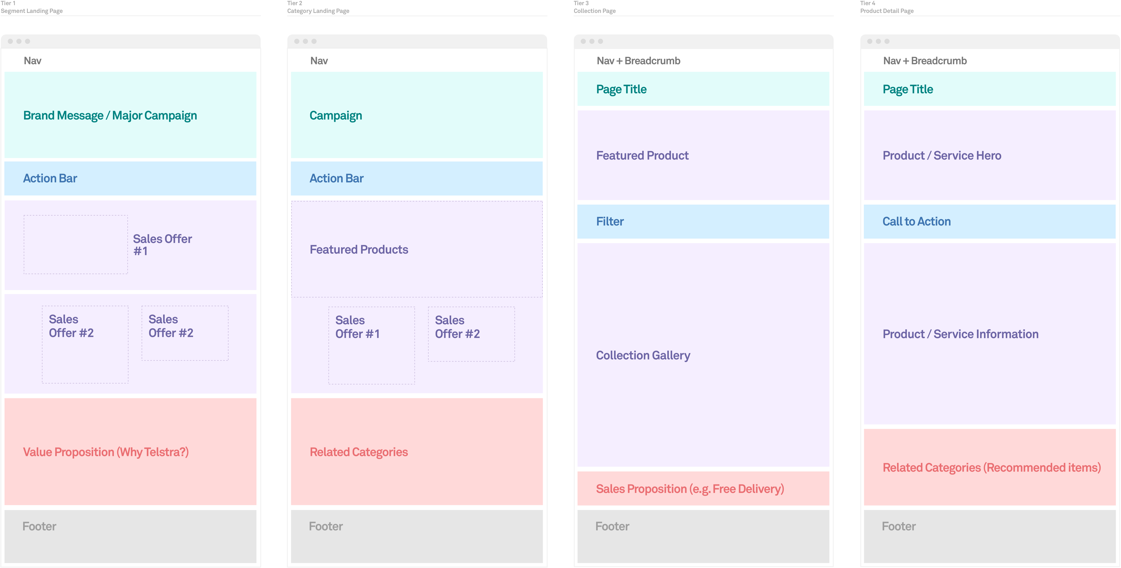
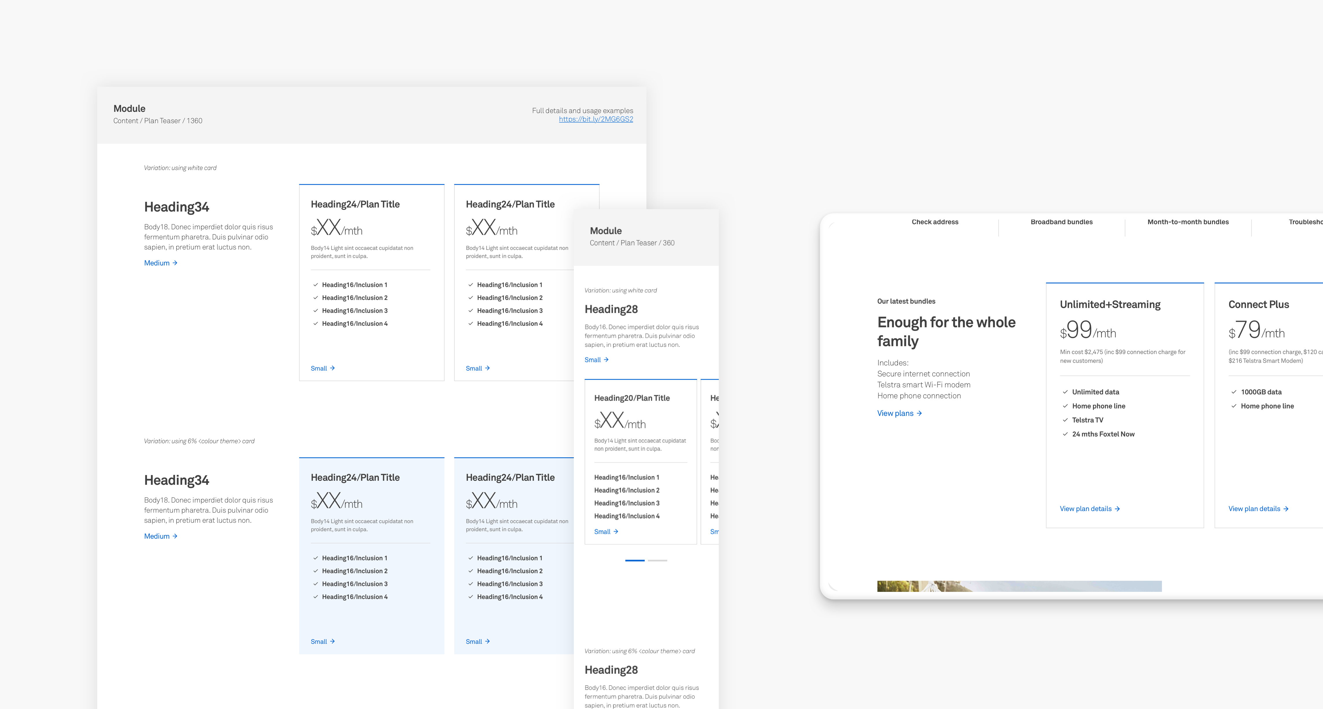
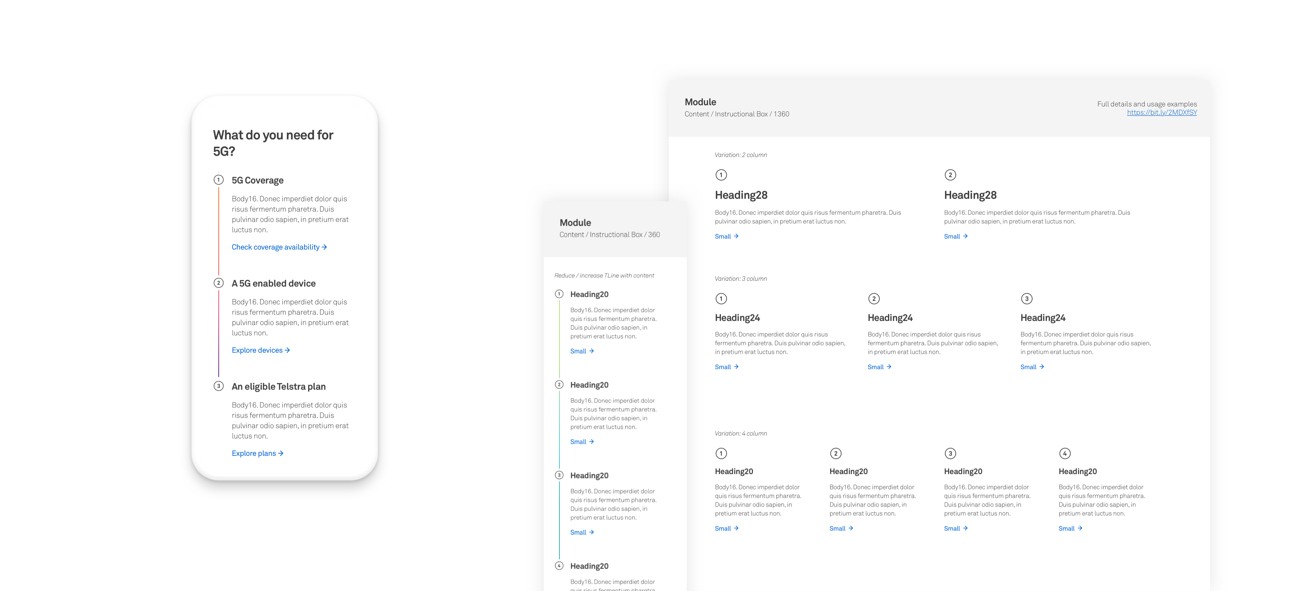
A collection of strategic templates were constructed to shape tiered experience flows for improved usability. The templates are the building blocks for establishing consistent mental models within t.com. The result is clear guidelines around combining modules across pages that teams can leverage to build cohesive customer journeys.
A collection of strategic templates were constructed to shape tiered experience flows for improved usability. The templates are the building blocks for establishing consistent mental models within t.com. The result is clear guidelines around combining modules across pages that teams can leverage to build cohesive customer journeys.
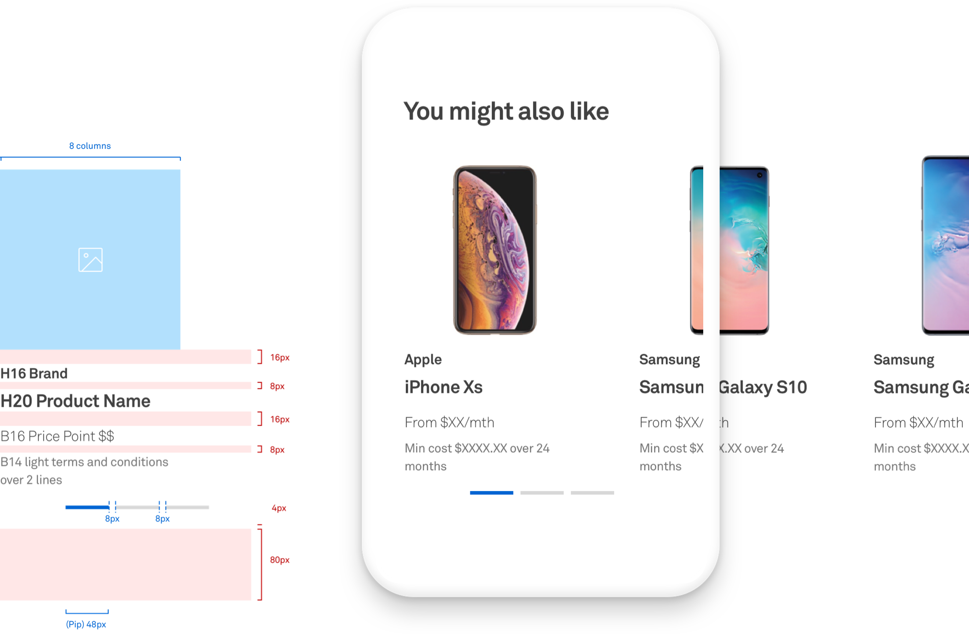
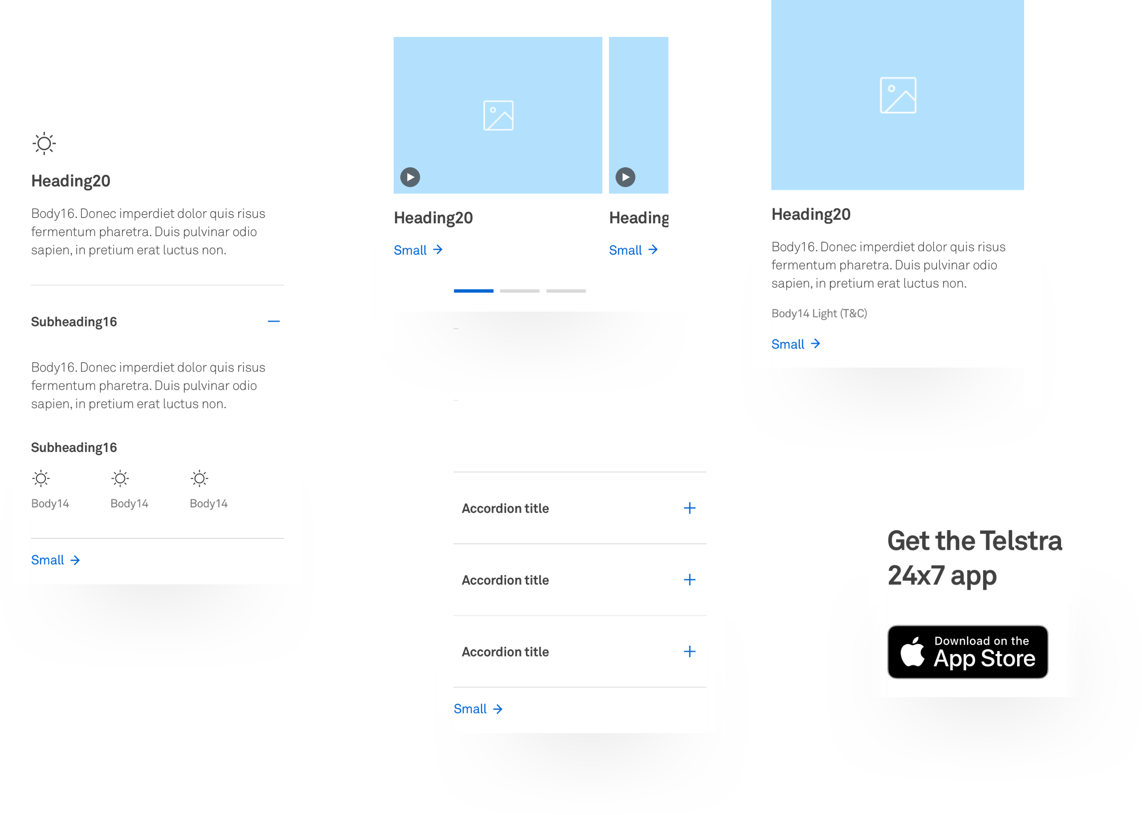
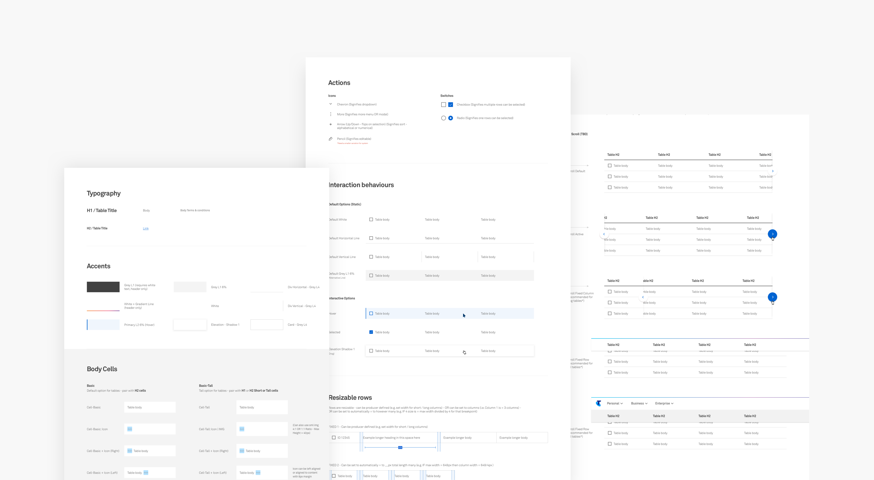
Part of succeeding in rolling out the new Visual Language was to build and maintain a holistic library of assets within a UI Kit and comprehensive Sticker Sheet. This evolved into the Responsive Web source of truth, created to unify teams and support consistent design and application of assets. These modules are mirrored in code meaning any experience constructed from the UI Kit could be quickly released to market with minimal production requirements.
Part of succeeding in rolling out the new Visual Language was to build and maintain a holistic library of assets within a UI Kit and comprehensive Sticker Sheet. This evolved into the Responsive Web source of truth, created to unify teams and support consistent design and application of assets. These modules are mirrored in code meaning any experience constructed from the UI Kit could be quickly released to market with minimal production requirements.
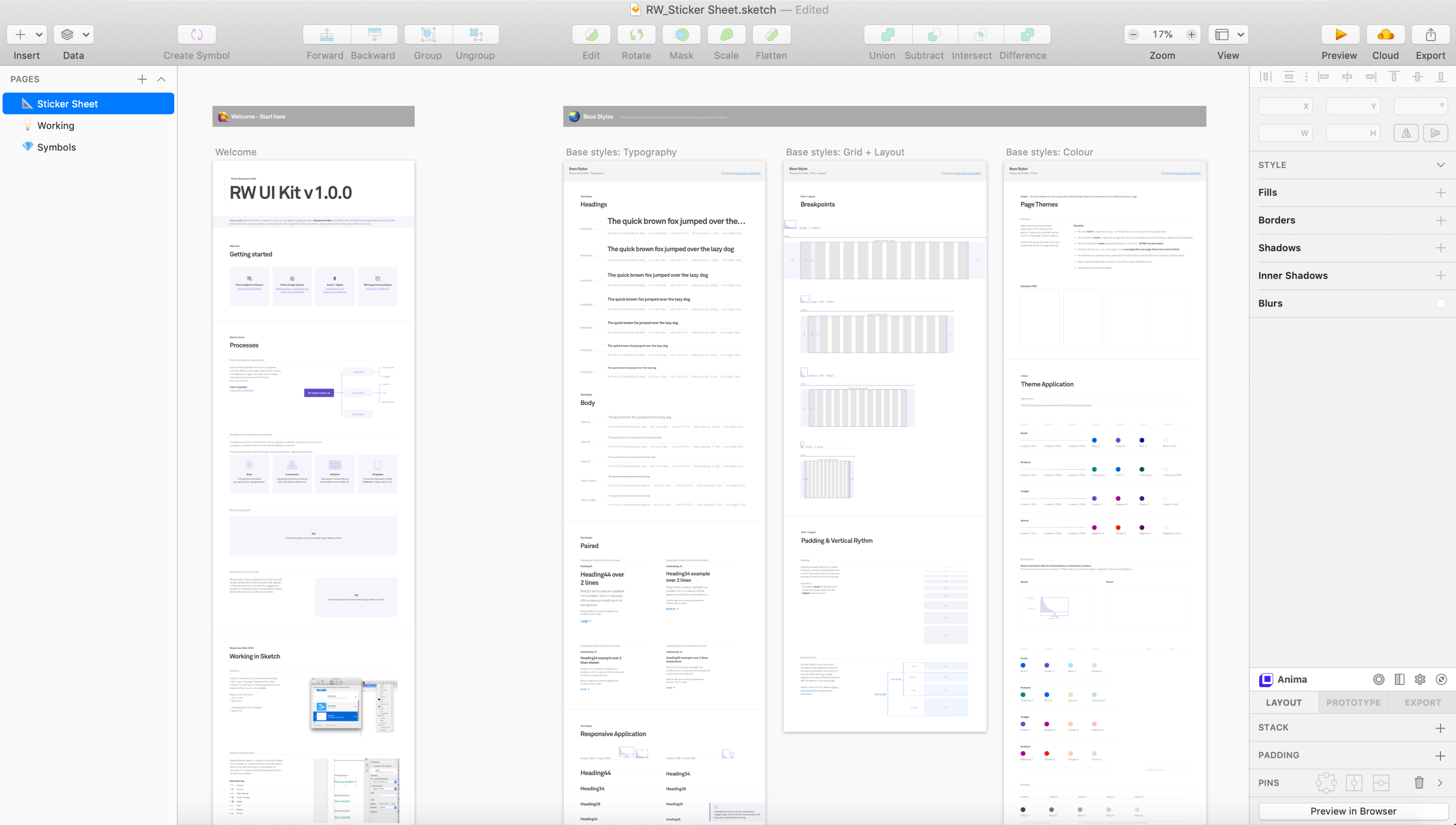
The UI Kit and Sticker Sheet is a collection of components and modules built as nested symbols with comprehensive overrides using Sketch Libraries. This RW assets linked to the more holistic or Core Library supported by the Telstra Design System. The outcome is a system of assets, working together to equip teams with the tools they require to rapidly iterate and manage design / tech debt.
The UI Kit and Sticker Sheet is a collection of components and modules built as nested symbols with comprehensive overrides using Sketch Libraries. This RW assets linked to the more holistic or Core Library supported by the Telstra Design System. The outcome is a system of assets, working together to equip teams with the tools they require to rapidly iterate and manage design / tech debt.
The final output is detailed documentation to provide clear rules and requirements for usage. This included content like module anatomy, specs, positioning, principles etc. It also enabled access to the extensive research that went into the construction of each module so teams can understand the rationale behind decision making - the thinking that transparency = increased adoption.
The final output is detailed documentation to provide clear rules and requirements for usage. This included content like module anatomy, specs, positioning, principles etc. It also enabled access to the extensive research that went into the construction of each module so teams can understand the rationale behind decision making - the thinking that transparency = increased adoption.
Hillary Purssey UI Designer
Rebecca Turner Lead UI Designer
Scott Lasak Lead UX Designer
Charlie Rundle UX Designer
Nadee Talagala Lead Front End Developer
Shruthi Viswanathan Front End Developer
Genevieve Lake BA / FED Developer
Simon Kirby Product Owner
John Lazzara Sponsor
+ offshore Development support